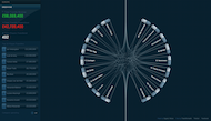
Vluchtelingen, de belangrijkste cijfers op een rijtje

Klaas Jan Runia (Rentalbarn Productions) sleutelde een interactieve infografiek in elkaar met een aantal kerngetallen over vluchtelingen in Nederland. Wel zo handig als je wilt weten waar we het over hebben. Spookverhalen genoeg: we zouden overspoeld worden door een tsunami van asielzoekers en die zouden de huizenmarkt overspoelen en een onevenredig beslag leggen op de publieke middelen. Maar hoe zit het nu echt? Zo'n strook is net iets te lang voor onze voorpagina, daarom eerst een grafiekje waaruit blijkt dat we rond de eeuwwisseling tweemaal zoveel asielzoekers in Nederland hebben gehuisvest als nu. Dat konden we toen aan, dus waarom zou Nederland de instroom nu niet aankunnen? Meer info hieronder.

Door: Foto: Sargasso achtergrond wereldbol
Foto: Sargasso achtergrond wereldbol

World of debt

De Visual Capitalist bevat een schatkamer aan infografiekjes, waaronder deze over de wereldwijde schuldenberg.

De percentages drukken het aandeel van de totale wereldwijde schulden uit, en hoe feller de kleur van het land, hoe hoger de schuld is als percentage van het eigen BNP.

Wat dan opvalt is dat ook landen waarvan wij menen dat ze er redelijk voorstaan, zoals de VS en Japan, een probleempje hebben.

h/t Alex Bukovsky

Foto: copyright ok. Gecheckt 29-09-2022

Three quarters of new cars sold in The Netherlands are black, grey or white

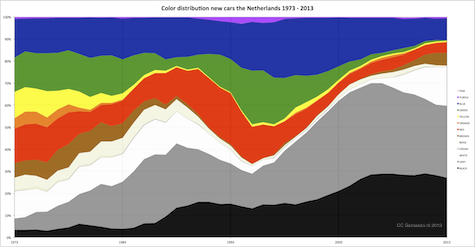
DATA - The streets in the Netherlands are becoming boring. In the early seventies three quarters of newsold cars had a bright color. These days three quarters of new cars sold are either black, grey or white.

All motorized vehicles in the Netherlands must be registered at the Rijksdienst voor Wegverkeer (RDW). A couple of months ago the RDW made a part of this registration openly available. With it you can download a set of records on cars containing the year they were first registered, the number of seats, the model, but also the basic color.

We picked 4 million records (roughly half the cars in the database) and plotted the distribution of the color through the years.
Here’s how it looks for the last forty years, starting in 1973:
car_color_1973_2013_NL_475

For those not familiar with these kind of graphs: we counted the number of cars for each color for each year. Per year all the cars together are 100% and we divided it in groups representing the percentage of that color so you can see the dominant colors for each year. So black, grey and white together represented almost 80% of all cars sold in 2013.

With fashion it’s known that during economic bad times black and grey become more prevalent. But the “bland” periodes for the cars exceed economic depressions…. So what explains it?

Foto: Mark (cc)

Meeste verjaardagen nieuwe generatie in september

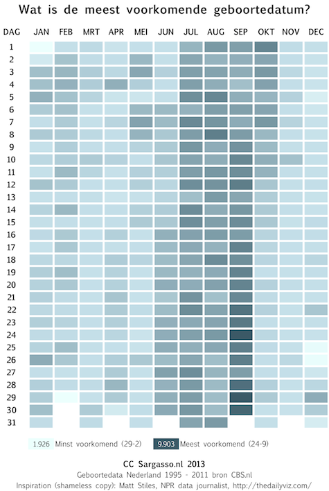
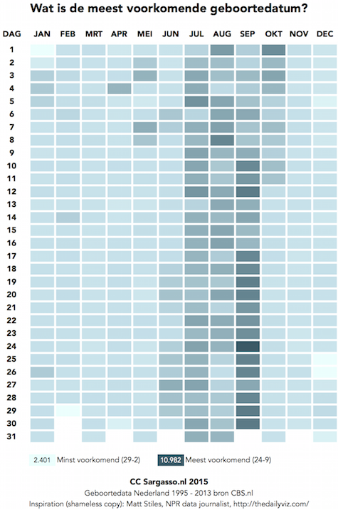
DATA - In Nederland komen verhoudingsgewijs de meeste kinderen in september ter wereld. Ze worden dus verwekt in de donkere decembermaand. 24 september is de meest voorkomende dag en 29 februari uiteraard de minst voorkomende.

geboortedatum_475

Als je alle geboortes van de periode 1995 tot 2011 neemt, wat leert ons dat dan?

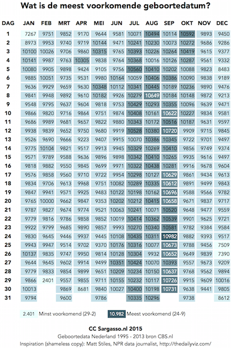
Dat op 24 september de meeste kinderfeestjes plaatsvinden (9903). En dat er dus heel veel grote mensen seks hadden rond 18 december 1 januari. Op de tweede plaats staat 29 september met 9899 geboortes. Die moeten dan op kerstavond verwekt zijn Dat waren goede voornemens.
De minst voorkomende geboortedag is uiteraard 29 februari met slechts 1926. Maar als we die buiten beschouwing laten vanwege zijn bijzondere karakter, is 1 januari de laagste met 6565 geboortes. Op 18 oktober, de datum vandaag, werden sinds 1995 8867 kinderen geboren.

Het gemiddelde per dag is ongeveer 8925. Dat is over zeventien jaar genomen. Per dag per jaar is het dan 525 geboortes.

Het valt sowieso op dat vaste feestdagen allemaal laag scoren. Koninginnedag met 7953, 5 december met 7639, 25 december met 6806 en 26 december met 6709. Ongeveer drie dagen later is er dan weer een klein geboortegolfje. Oftewel, het uitstellen van een geboorte lijkt mogelijk te zijn.

Steun ons!

De redactie van Sargasso bestaat uit een club vrijwilligers. Naast zelf artikelen schrijven struinen we het internet af om interessante artikelen en nieuwswaardige inhoud met lezers te delen. We onderhouden zelf de site en houden als moderator een oogje op de discussies. Je kunt op Sargasso terecht voor artikelen over privacy, klimaat, biodiversiteit, duurzaamheid, politiek, buitenland, religie, economie, wetenschap en het leven van alle dag.

Om Sargasso in stand te houden hebben we wel wat geld nodig. Zodat we de site in de lucht kunnen houden, we af en toe kunnen vergaderen (en borrelen) en om nieuwe dingen te kunnen proberen.

Foto: copyright ok. Gecheckt 08-09-2022

Infographic Directory

Information graphics or infographics are graphic visual representations of information, data or knowledge. These graphics present complex information quickly and clearly, such as in signs, maps, journalism, technical writing, and education.

Today information graphics surround us in the media, in published works both pedestrian and scientific, in road signs and manuals. The Infographic Directory is a blog by David Eaves featuring awesome quality infographics from around the internet in a wide range of categories.

Meer verstrooiing bij The Presurfer.

Foto: Sargasso achtergrond wereldbol

The Visual Du Jour – Stealth Conflicts

Stealth conflict is, of course, a concept borrowed from Virgil Hawkins, denoting conflicts that are by and large ignored by Western media for a variety of reasons (as opposed to chosen conflicts). As a result, a stealth conflict, when it is not completely ignored, is often treated as impossible to explain, based on ancestral tribal rivalries that are so atavistic as impossible to stop (the underlying colonial racist logic is only thinly veiled here).

The most egregious example of stealt conflict is, of course, the conflict in the DRC but Somalia does not rank far behind. So, it is nice to see at least an attempt at explaining the sequence of events that led to a country without government and torn by conflicting parties:

It is a nice attempt but it is very light on content and quite simplified, which is a common problem when one designs infographics: striking the right balance between overloading the visual with information v. oversimplifying. But it is more attention than this conflict has received. Actually, most of the attention paid to Somalia has been on pirates because they kidnapped Westerners or threatened Western interests.

cc Flickr Photo, Africa Renewal

Lezen: Mohammed, door Marcel Hulspas

Wie was Mohammed? Wat dreef hem? In deze vlot geschreven biografie beschrijft Marcel Hulspas de carrière van de de Profeet Mohammed. Hoe hij uitgroeide van een eenvoudige lokale ‘waarschuwer’ die de Mekkanen opriep om terug te keren tot het ware geloof, tot een man die zichzelf beschouwde als de nieuwste door God gezonden profeet, vergelijkbaar met Mozes, Jesaja en Jezus.

Mohammed moest Mekka verlaten maar slaagde erin een machtige stammencoalitie bijeen te brengen die, geïnspireerd door het geloof in de ene God (en zijn Profeet) westelijk Arabië veroverde. En na zijn dood stroomden de Arabische legers oost- en noordwaarts, en schiepen een nieuw wereldrijk.

Je eet 3496 liter water per dag.

Als je uitrekent hoeveel water er gebruikt wordt bij de productie van het voedsel dat wij eten, schrik je je een hoedje. Scroll je suf en ontdek hoe Angela Morelli tot het getal 3496 liter komt.

Volgende